Members of DBS’ UX & Design team offer a peek into what they do
It is often said that good design is invisible – it engages users with a product, a website, a mobile application without calling attention to itself. And just as good design works quietly in the background, so do the creators who, away from the public eye, are busy learning about behaviours, trends and devising solutions to problems that may not even be apparent yet.
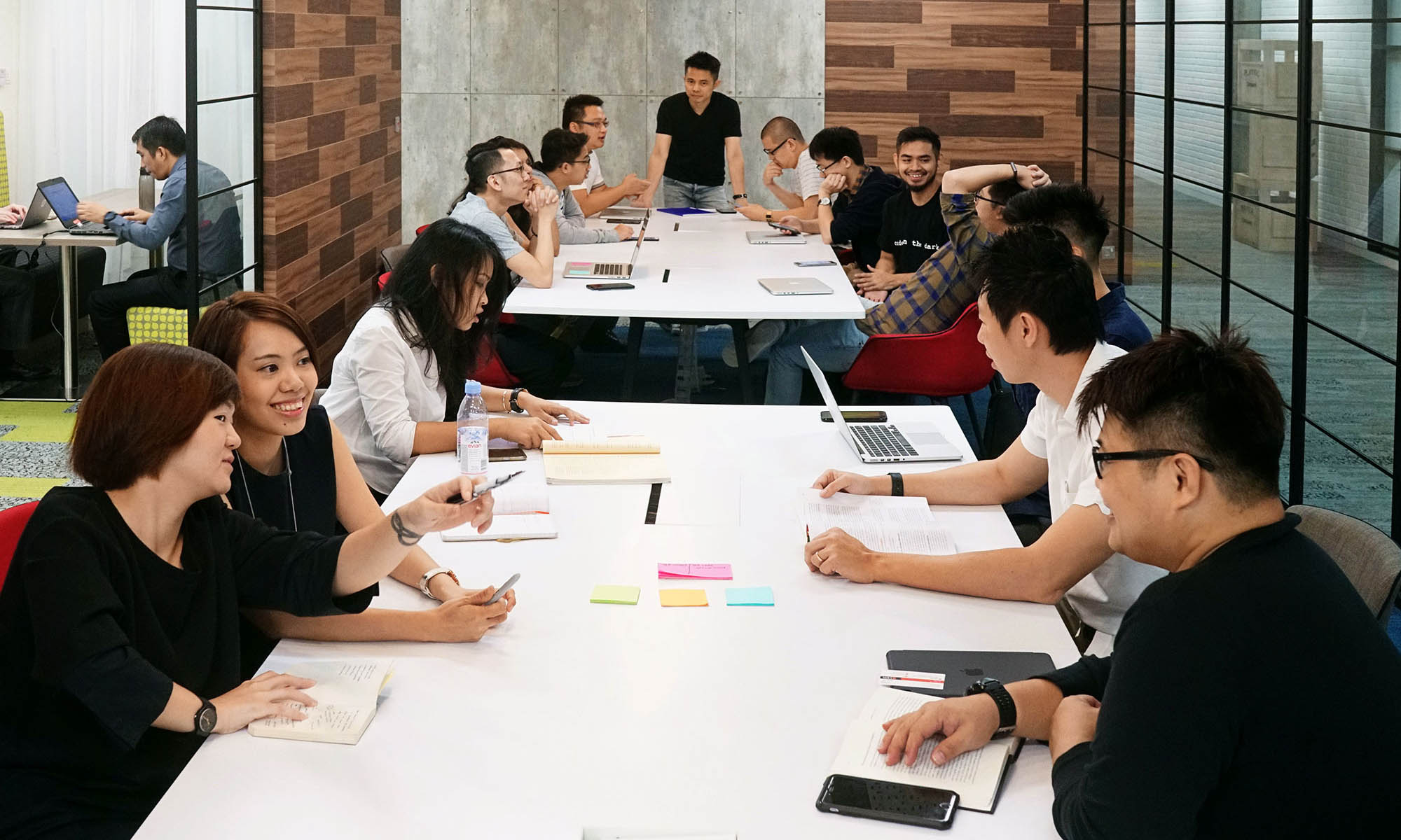
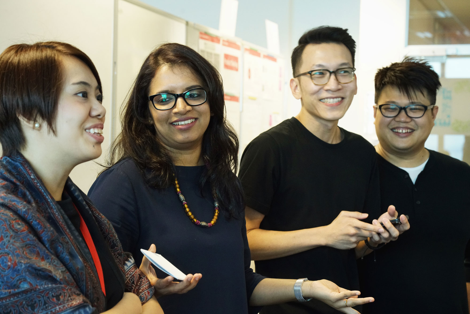
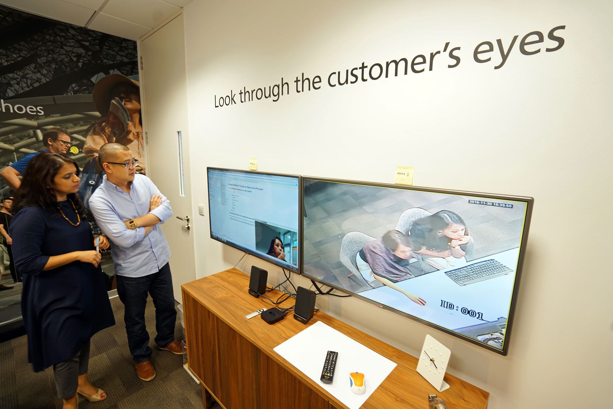
What goes on behind the scenes in these design teams? We find out from four members of DBS Bank’s UX & Design team, which totals more than 30 diverse individuals (and it’s expanding!) from all over the world, including Singapore, India, China, UK, Thailand, Indonesia, Taiwan, Japan, Malaysia. This multi-faceted team studies user behaviour and builds the bank’s digital products, from websites to mobile banking applications, with the aim of delivering elegant, efficient and enjoyable experiences.

Here’s what we learnt:
1. Non-banking apps serve as inspiration; they also set the bar
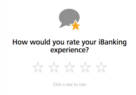
If you’ve used some of DBS’ online services lately, you’ll notice you’re asked to rate, out of five stars, how the experience was. The idea to introduce a rating system was inspired by apps like Uber and Grab, which ask users to rate their drivers.
“So why not try that for DBS’ apps as well, to get a gauge of how people feel about our products?” says Serene Yap, one of the product designers involved in developing this rating system.
Industry veteran Chihiro Hosoe, who heads the digibank India and Indonesia design team, notes the high bar set by quality mobile apps which increasingly emphasise user experience.
Everyday mobile apps such as Uber, WhatsApp, and Instagram spend a lot of effort on user experience. This sets high standards in the minds of customers and that changes the scene, for the banking industry as well.
2. Beyond making things beautiful, the job’s really about problem-solving
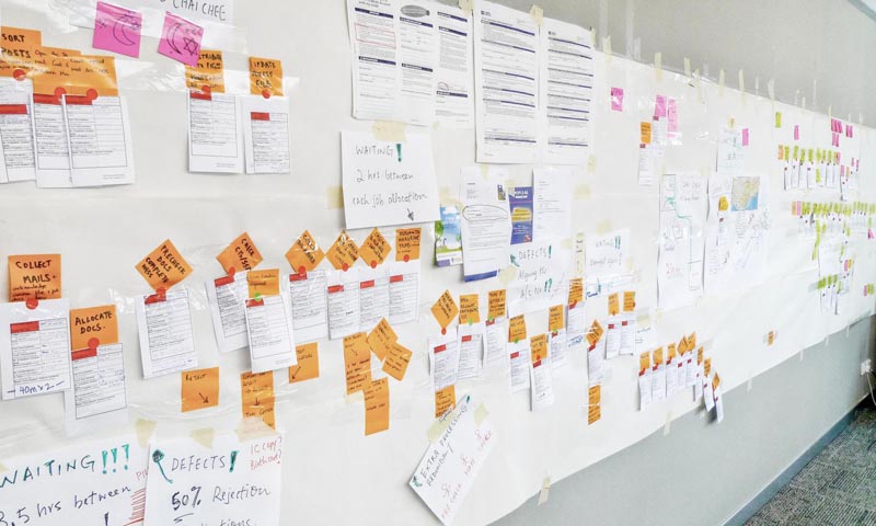
Designer Nicholas Tan describes: "We’re designing solutions, solving problems for people…the design matters, it’s given, it should be beautiful. But the first thing that should be done is to solve the problem."
When designing for mobile wallet DBS PayLah!, Nicholas, the lead designer for this project, and the team started by identifying one of the main problems with payments – the inconvenience of having “to go to ATMs, get bank account numbers, and so forth to make transactions”.
"That’s why we conceptualised a way for people to make transactions just through their phone numbers, instead of going through the usual process of using fund transfers," he says.

 Hong Kong
 India
India Indonesia
 China
China Taiwan
